The New Cartographers
Faculty across the arts and sciences are navigating the new world of big data.
The utility of a map depends on what you ask it. You can ask it how to get to where you’re going—likely the most common question we ask of maps. But you can also ask a map to answer other things: where we’ve been, what’s been lost, what life is like on a particular street, or what secrets far-off galaxies hold.
The COVID-19 pandemic has many of us particularly attuned to what maps can tell us. With maps, we can trace the spread of the disease and imagine different futures as scientists and lawmakers test different scenarios.
Penn Arts & Sciences faculty are asking big questions and using maps to find answers. Across disciplines, maps are valuable tools for making sense of large amounts of data and for understanding relationships of all types. Spatial relationships, of course, but also economic, political, historical, and environmental ones.
Researchers can map increasingly complex pieces of information largely because of two scientific advances: big data and machine learning.
Maps can chart these complex relationships because of how they’ve evolved with technology. What once were discrete physical objects can now be digital, interactive, layered modes of exploration.
Researchers can map increasingly complex pieces of information largely because of two scientific advances: big data and machine learning.
Big data’s popular definition—a variety of data, arriving at an ever-increasing volume with an ever-higher velocity— only hints at all the information it contains. Every social media post liked, every symptom searched or question queried: that’s part of big data. Jet engines and sensors that monitor their performance generate big data. So do apps on your phone that know where you are and what you like.
This is where machine learning comes in. It can handle the information big data pumps out because it can perform analytic tasks without explicit programing or instruction. Machine learning can generate an email in your inbox that says, “Rainy days call for ordering in,” with a link to that last order from your go-to takeout spot.
In academia, big data and machine learning are put to use for other purposes, but the tools are the same. Advanced maps can be a useful way for making sense of enormous amounts of information, allowing users to interact with data in a way they couldn’t before. They can zoom in on a digital map, examining a single street. Or they can filter a map, only seeing the information that’s most useful or interesting. Maps’ many layers offer a powerful flexibility.
With a proliferating amount of data and the flexibility and power of digital tools, researchers are spoiled for choice. What information should they use, and what should be left out? The key, says, Daniel Aldana Cohen, Assistant Professor of Sociology, is “not to be intimidated by large data sets and instead approach data with questions about how the world works.”
All of the technology at our disposal would be of little use without a human hand to guide it. The faculty members profiled here bring their training to bear on big data, asking it questions shaped by disciplinary concerns and guided by insights gleaned by previous research. The answers, plotted on digital maps of city blocks, ancient sites, and vast sectors of the night sky, chart a new way for scholarship.

A Portal Into the Past
As an anthropological archaeologist, Emily Hammer has used maps for her entire career, but in that time the very concept of a map has changed. “I feel very differently from undergraduates I teach,” says the assistant professor of Near Eastern languages and civilizations. “For them, a map is a backdrop because your phone can tell you where to turn, and I remember this time when maps were primarily objects.”
Emily Hammer, Assistant Professor of Near Eastern Languages and Civilizations
Hammer is taking full advantage of advances in digital mapping, from compiling big data and conducting quantitative spatial analyses, to creating interactive maps that both academics and laypeople can explore and build upon.
For as long as archaeologists have excavated ancient sites, they have mapped the architecture and items they found, painstakingly measuring and drawing plans. In the mid-20th century, they expanded their horizons to include the space around these sites, showing the relationship of sites to environmental features like current and ancient river channels, different types of soils, and other settlements. They started using aerial photos that could show traces of long-ago waterways or fields.
Around 2014 or 2015, Hammer and Jason Ur of Harvard University realized that photos of the Middle East taken by U-2 spy planes starting in the 1950s would be invaluable for this type of work. They spent five years tracking down, reproducing, and indexing U-2 negatives in the National Archives. To generate archaeological data for their work on ancient Mesopotamian cities, they trace archaeological features and sites visible in the images. These data are combined with on-the-ground observations to create more accurate and informative map representations of ancient landscapes, environments, and settlements.
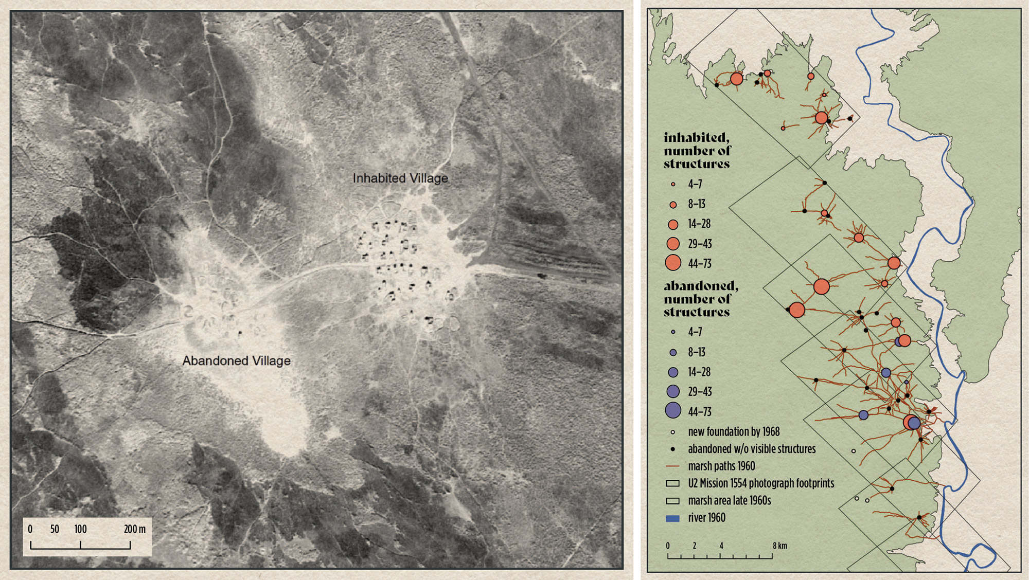
(L–R) U-2 images of southern Iraq in the late 1950s and early 1960s show the position of Marsh Arab communities, many of which disappeared after hydroelectric dams impounded the rivers, and the government of Saddam Hussein drained the marshes; Distribution and size of Marsh Arab villages in the Central Marshes of southern Iraq, U-2 mission 1554, January 1960.
The timing of the U-2 images was important. “In the mid-20th century in the Middle East, cities were starting to grow and modern mechanized agriculture was introduced in many rural areas for the first time,” Hammer explains. “Traces of archaeological features started to be erased by development much faster than they had been before.”
The U-2 images also give a window into the lives of Marsh Arabs, groups of people living in wetlands in South Iraq. More than half a million people lived in reed houses, fishing, hunting, harvesting reeds, and herding water buffalo, until Saddam Hussein drained the marshes in the 1990s. “This is a destroyed way of life,” says Hammer. “But with U-2 photos we can travel back in time see what life was like in the world of the marshes.”
Mapping has also been enhanced and greatly eased by the development of GPS technology, now readily available, inexpensive, and accurate to within a meter. Researchers use drones to take their own aerial shots and gather topographic data. The amount of free geospatial data archaeologists can access, through government repositories and Google Earth, has grown exponentially. And digital mapping software allows them to put it all together in new ways—from discovering the suburbs surrounding the ancient Mesopotamian city of Ur, to a project by Hammer’s students, who mapped patterns among the graves of commoners buried in Ur’s “Royal Cemetery.”
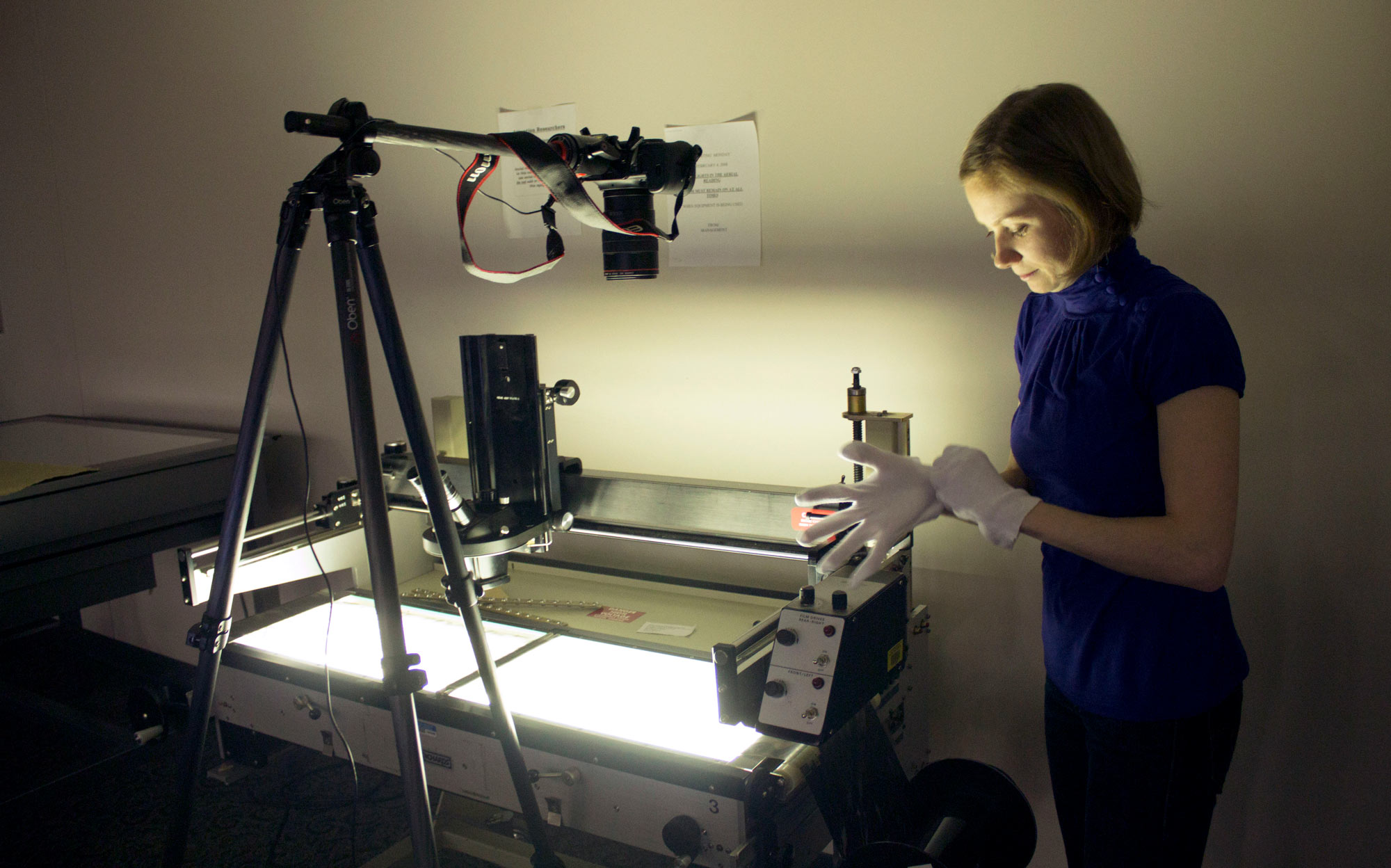
Using a light table, Emily Hammer, Assistant Professor of Near Eastern Languages and Civilizations, prepares to photograph U-2 negatives at the National Archives’ Aerial Film Section.
Hammer is also a member in the global collaborative project “LandCover6K,” which brings historians and archaeologists together to reconstruct human land use over the last 6,000 years in order to improve climate change modeling.
It’s increasingly easy to create interactive maps so that a viewer can look at things at different scales or move around.
Hammer creates interactive online maps to go with most of her publications, both for her academic audience and for laypeople. “It’s increasingly easy to create interactive maps so that a viewer can look at things at different scales or move around,” she says, “and that allows your audience to really explore your data and see how you came up with your conclusions, or even create alternative interpretations of your data.”
“Broadly, archaeology and anthropology are interested in how humans relate to their environment, which is inherently a spatial question,” says Hammer. “Maps help us to see broader patterns and quantitatively analyze them. They can help us understand demographic changes, like when and how people congregated in cities, or dispersed back to villages after that. When dealing with places that are far away in time or distance, maps can help us to visualize the space in which people were living or moving.”

Cities Large and Small
Many historians work by narrowing their focus, becoming an expert on the intricacies of a historical person, event, or text. Going deep—that’s how Brent Cebul, Assistant Professor of History, was trained. But now, he’s taking a step back and considering the big picture.

Brent Cebul, Assistant Professor of History
“Mapping is exciting because it invites a certain way of doing history that’s very different from the way scholars often work,” he says. “It invites a certain comprehensiveness and comparative quality, as well as the opportunity to look at a historically rich set of data and consider things spatially and longitudinally.”
Cebul started his career as a student of American political development and policy history. “The problem with being interested in that kind of thing is that it’s often difficult to get non-specialists interested,” he explains. “Maps literally meet people where they are and where they live. We can use that connection to build a bigger story.”
Cebul’s postdoctoral fellowship at the University of Richmond was an opportunity to tell an important story. In 2015, he became a lead project investigator on a team that located, compiled, and studied federal urban renewal data available between 1950 and 1966. Urban Renewal, a $13 billion federal project that stretched across three decades, was intended to redevelop cities by acquiring property by right of eminent domain and clearing them for new public and private housing. Over the years, the program was increasingly used to develop commercial properties. It had the practical effect of forcing hundreds of thousands of families from their homes. Disproportionately, these were families of color. The research project is called Renewing Inequality.
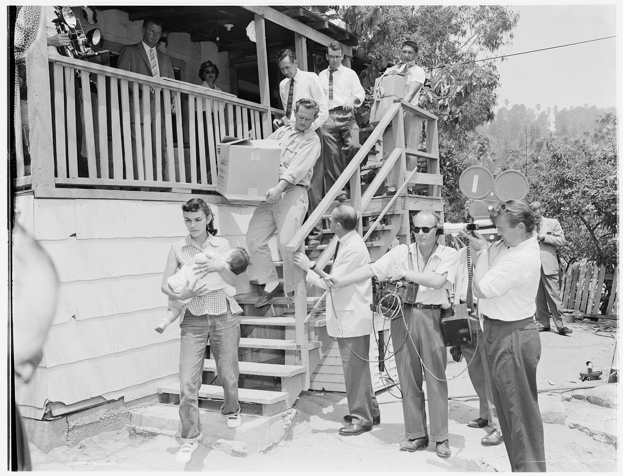
In Chavez Ravine, a traditionally Mexican American neighborhood in Los Angeles, families were evicted under urban renewal. This photo, taken on May 8, 1959, shows Victoria Angustain and her son Ira being led from their home by law enforcement officers.
USC Digital Library, Los Angeles Examiner Photographs Collection
“Many people, including historians, think of it as a northern, big city program,” Cebul explains. “But when we got the federal records showing the municipalities that received funds, we found that the majority of urban renewal projects were in cities of 50,000 or fewer people. And small cities in Alabama and Georgia actually had a high number of projects. This was amazing to see.”
Renewing Inequality shows not only where these projects took place, but also how many families were displaced in each city and the proportion that were White or of color. The resulting map shows projects concentrated in major metropolitan areas including New York, Philadelphia, and Chicago, but also more than 600 smaller projects on the East Coast from Maine to Puerto Rico, spreading west to Kansas, Texas, California, and Alaska, in cities as large as San Francisco and as small as Valdez, Alaska (population in 1960: 555, 140 families removed from their homes).
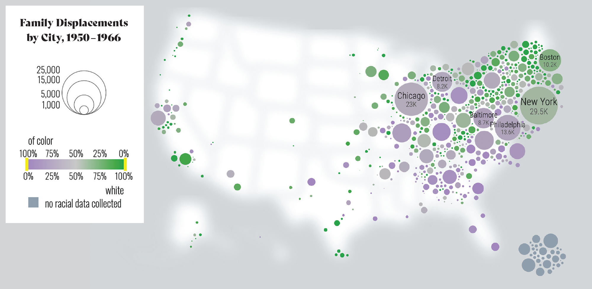
Renewing Inequality maps family displacement, taking into account the geographic and racial distribution along with the total number of impacted families.
Digital Scholarship Lab, University of Richmond
“Without mapping, I could go to a conference and announce, ‘Hey! Gadsden, Alabama had an urban renewal program.’ That wouldn’t get much of a reaction,” Cebul explains. “But if I’m able to show them this map, I can say ‘Look at this! The vast majority of urban renewal projects were in small municipalities. We fundamentally misunderstand the program.’ Organizing this data into maps mounts a campaign to change the way that scholars think about history.”
Cebul says it’s important to build a more complete view of history to understand how it continues to reverberate. Affected communities lost more than homes, they lost support networks, local traditions, and rates of business and home ownership that impact financial stability for generations.
The Renewing Inequality project demonstrates that smaller cities were often more likely to force families of color to bear the brunt of displacement. In Lubbock, Texas, for example, 92 percent of the population was White, but nearly all of the 1,300 families displaced were of color. Larger cities were not exempt from targeting families of color: The largest urban renewal project was in Cincinnati, where 5,000 Black families were displaced from the Kenyon-Barr neighborhood, effectively removing the community from the map.
Maps literally meet people where they are and where they live. We can use that connection to build a bigger story.
Cebul came to Penn in 2018, but he continues to contribute to Renewing Inequality and use it as a classroom tool, integrating undergraduates’ research into the map and website.
He stresses the collaborative aspects of any mapping project: students, coders, and data managers help to translate historical records into interactive maps that tell big stories. In 2019, two undergraduates in Cebul’s class, Victoria (Tori) Klevan, C’19, and Victoria Reeser, C’19, made original contributions to Renewing Inequality, correcting the record about renewal programs undertaken in Lower Merion along Philadelphia’s Main Line. Thanks to the contributions of so many, the historical record continues to evolve.
“My job is to conceptualize and determine what historical questions we’re trying to answer,” says Cebul. “We collect and organize the data, and then I let myself be surprised by the results.”

Getting Granular
When you have a lot of data, there’s a lot of math and a lot of judgement calls,” says Daniel Aldana Cohen. “My judgement calls are driven by social science.”
Daniel Aldana Cohen, Assistant Professor of Sociology
Cohen, Assistant Professor of Sociology, asks questions about climate change and inequality. That’s an important pairing, he says, because it’s an uncommon one that provides unique insights. Most visual representations of climate change map its impacts: extreme temperature, flooding, and fire risk, to name a few. While impacts are important, these types of maps don’t address the causes of climate change, and thus cannot lead to actionable solutions.
Cohen is involved in several mapping projects, all related to climate change and the lived experiences of people feeling its effects. He and collaborators have mapped the carbon footprints of neighborhoods and studied the economic and environmental effects of powering public housing across the country with renewable energy. Cohen’s research contributed to the Green New Deal for Public Housing Act, introduced into Congress in fall 2019. He directs the Socio-Spatial Climate Collaborative, known as (SC)2, based in Penn’s Population Studies Center (PSC). With Kevin Ummel, a research affiliate of PSC; Nick Graetz, a doctoral candidate in sociology; and Pilar Gonalons-Pons, Assistant Professor of Sociology, Cohen and (SC)2 are working to create a public database of household and neighborhood carbon footprints, as well as a climate vulnerability index.
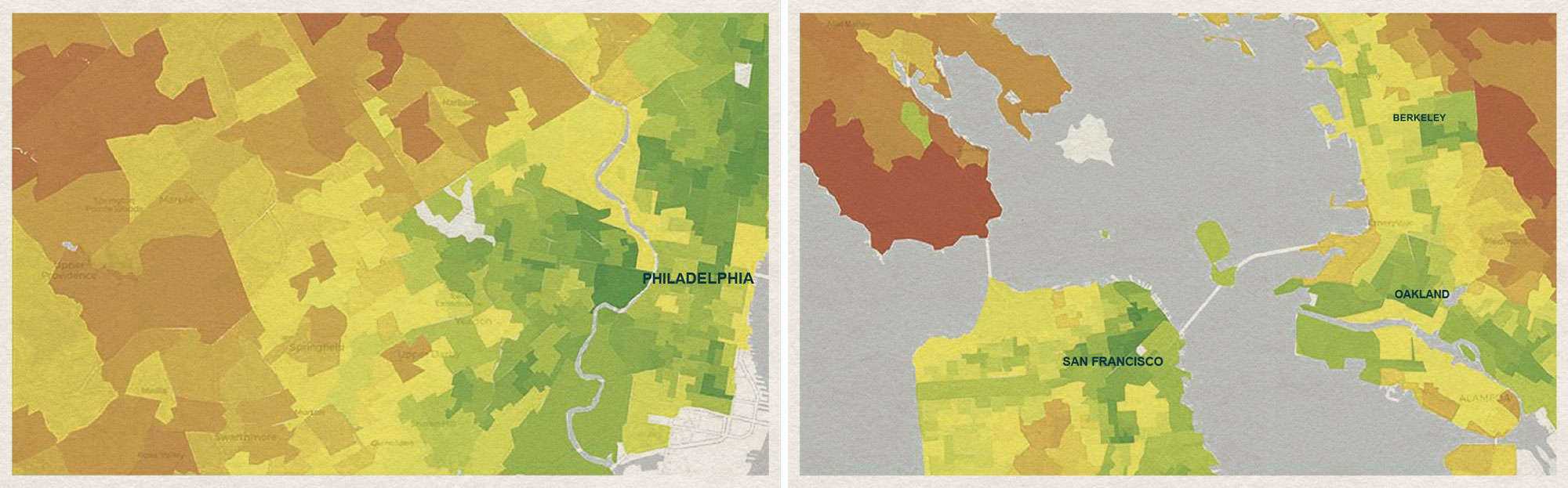
Community climate mapping displays per capita utility and auto emissions at neighborhood level. These maps show the Philadelphia region (left) and San Francisco’s Bay Area.
Socio-Spatial Climate Collaborative
“It’s really exciting to take a concept that often feels abstract and make it feel visceral and concrete,” he says. “Mapping allows people to think about the relationships between their own neighborhoods and climate change.”
Granular information about neighborhoods is an important part of Cohen’s work. Government data is often broken out at the county level, which elides major economic differences between neighborhoods. By using machine learning to examine data from multiple sources, Cohen is able to get a three-dimensional picture of what’s happening on the ground in specific neighborhoods.
It’s really exciting to take a concept that often feels abstract and make it feel visceral and concrete.
(SC)2’s heat mapping research is an example of what big data can tell us and how that might lead to action. The project begins with a question: Where are people vulnerable to extreme heat, and how can we understand what causes that vulnerability?
To answer, Cohen gathers data about neighborhood demographics and redlining, a New Deal policy that withheld mortgages from so-called undesirable neighborhoods, often low-income, inner city, and Black communities. A lack of investment going back nearly 100 years means that to this day, these communities have more concrete and less green space than neighborhoods not subject to redlining, so he looks at established data about the rate of temperature difference depending on the number of trees in an area.
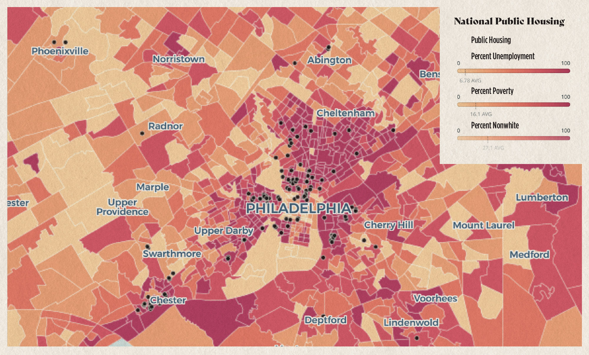
Maps that include variables such as unemployment, race, poverty levels, and population density show the breadth and diversity of American Public Housing Communities, which are found in cities and rural areas all across the country.
Katie Lample, Nick Graetz, Alexandra Lillehei, Daniel Aldana Cohen, Billy Fleming with support from the McHarg Center, Socio-Spatial Climate Collaborative, Data for Progress, and the Price Lab for Digital Humanities.
“This is called the urban heat island effect,” he explains. He says that between places like North Philly, with no trees, and wooded areas like West Philly, there is a dramatic temperature difference—up to 20 degrees.
“Here’s where it gets really interesting,” he continues. “North and South Philly were both redlined and have almost no trees. They’re exposed to the same temperature burden. But things have changed, and now South Philly is a much wealthier neighborhood.”
Analyzing data about electric costs, Cohen found that residents of North Philly spend a much higher percentage of their income on electricity. And other data reveal that total energy use is highest in poor households, because the homes aren’t insulated and heating and cooling equipment are old.
“Residents of North Philly are exposed to higher temperatures than other parts of the city and they are less able to afford air conditioning,” Cohen concludes. “That means their options are to keep their homes at unsafe temperatures, or sacrifice other necessities, such as food.”
Targeted policies can tackle inequality and the causes of climate change in one fell swoop, says Cohen. Green energy retrofits in a neighborhood like North Philly could insulate homes and install efficient equipment, lowering costs and carbon emissions at once.
“When it comes to climate change,” Cohen says, “the challenge is not finding information. The challenge is asking how that information can help us understand complex stories and inform action.”

Mapping the Night Sky
Maps are most often associated with land and sea, but without mapping, physicists, astronomers, and cosmologists would be lost among the stars.
Bhuvnesh Jain, Walter H. and Leonore C. Annenberg Professor in the Natural Sciences and Co-Director of the Center for Particle Cosmology
“Big maps of the sky are part of both the visceral and the scientific appeal that drew some of us into astronomy in the first place,” says Bhuvnesh Jain, Walter H. and Leonore C. Annenberg Professor in the Natural Sciences and Co-Director of the Center for Particle Cosmology. “A century ago, there were basic questions about the night sky: What are these fuzzy blobs we see in the sky? It turned out they were entire galaxies—“island universes”—not gas clouds in our own galaxy. Many advances in the field came about through the use of maps, increasingly by applying statistical techniques to the data.”
Observation improved with the launch of the landmark Hubble Space Telescope in 1990, which has captured more than 1.3 million images in its 30-year orbit. As the number and quality of pictures increased, researchers devoted efforts to examining parts of the universe that had never before been observed.
Fast forward to 2020—Jain, along with his collaborators, is now involved in the next era of observation projects, which include the Dark Energy Survey (DES), the Large Synoptic Survey Telescope (LSST), Simons Observatory, Wide Field Infrared Survey Telescope (WFIRST), and Euclid.
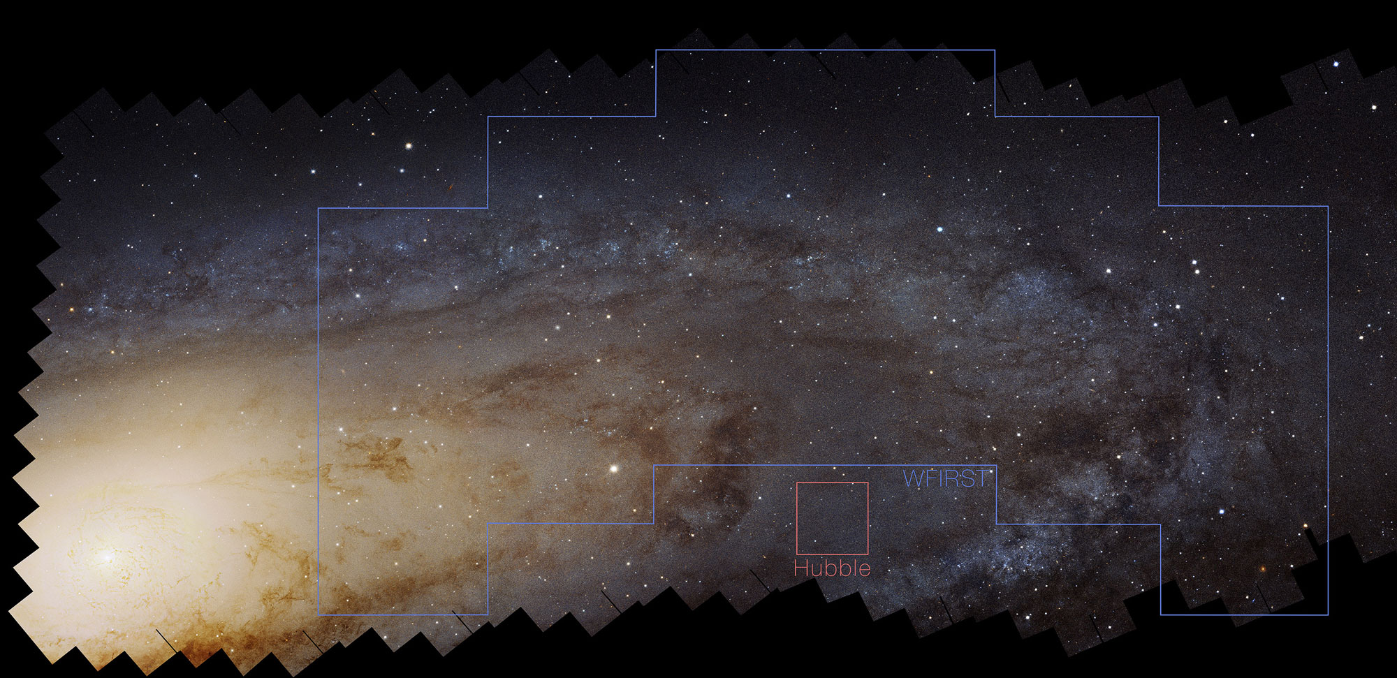
“This image shows our neighboring spiral galaxy, Andromeda (aka M31), as it would be viewed by WFIRST,” Jain says. “The field of view of WFIRST is a hundred times larger than that of the Hubble Space Telescope! WFIRST would also image in infrared light.”
Andromeda With WFIRST
DES, which launched in 2013, is the furthest along of these projects. It has completed the data-gathering phase of its mission, providing researchers with over 300 million images, about half of which have been analyzed. An international collaborative effort, DES seeks to map hundreds of millions of galaxies, detect thousands of supernovae, and find patterns of cosmic structure that they hope will help reveal clues about the mysteries surrounding phenomena like dark matter.
“Is dark matter confined around galaxies and clusters, or are there strands and sheets of dark matter that fill the universe? How does it affect the expansion of the universe, along with the even more elusive dark energy? These are the types of questions DES is helping us answer,” says Jain.
DES also uses visible light filters to help scientists distinguish the colors of stars and galaxies.
“A galaxy that’s forming new stars tends to have hotter, bluer stars, while old galaxies get redder,” says Jain, who works on the project with Masao Sako, Associate Professor of Physics and Astronomy; Gary Bernstein, Reese W. Flower Professor of Astronomy and Astrophysics; and Mike Jarvis, a research scientist in physics and astronomy. “Using the colors of galaxies helps us track their distances, which in turn helps map the expansion history of the universe.”
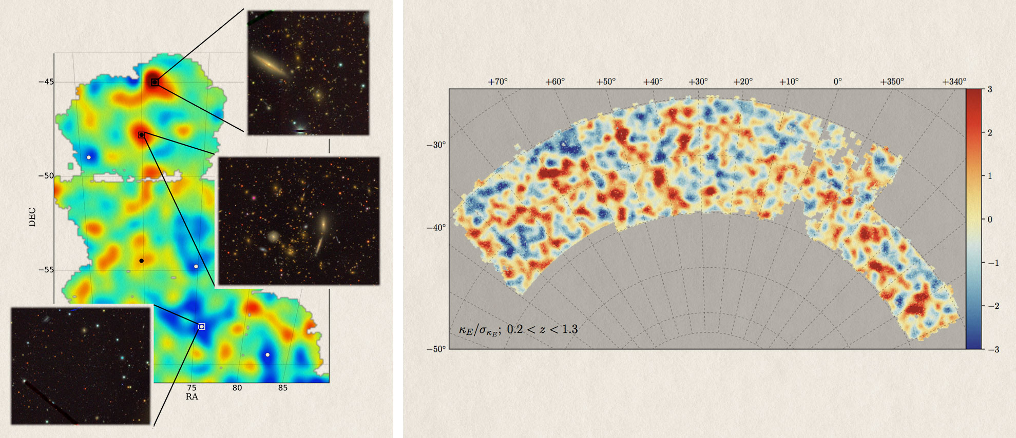
The first mass map (left) was “an exciting proof of concept,” Jain says. “We found one of the biggest dark matter superclusters and verified it did have a filament of galaxy clusters associated with it, then we applied the technique to the first full year of data and got the bigger mass map (right). This new map spans 1,300 square degrees, approaching 10,000 times the size of the moon on the sky. It is so large that we see the pattern of pristine fluctuations—that is, they haven’t been altered by complex physics—that originated around the time of the Big Bang. The way we study them is statistical. The properties of the pattern tell us about the initial conditions and dark matter.”
Dark Energy Survey collaboration
Examining millions of images directly would be impossible for even the largest team of researchers, so Jain and the DES team employ statistical algorithms and machine learning techniques. This big data approach allows researchers to compare DES images with high-resolution Hubble images to provide clearer analysis.
Though all of the survey projects Jain and his colleagues are involved in are similarly dedicated to mapping out celestial bodies in the night sky, the big difference is some of the telescopes are land-based, and some have been launched into space.
WFIRST and Euclid are space-based, and can see much further than their ground-based counterparts. Using a telescope mounted on a satellite, WFIRST can glimpse and map out the first generation of galaxies, which allows researchers to pursue questions about how said galaxies were formed. It also has the capability to detect planets by observing their effects on star light.
An international collaborative effort, DES seeks to map hundreds of millions of galaxies, detect thousands of supernovae, and find patterns of cosmic structure.
The land-based projects—DES, LSST, and Simons—are all located in Chile, ideal due to its elevation and its dry climate, which prevents moisture in the air from interfering with the sharpness of images.
LSST will help scientists track space events over time by analyzing variables such as how a massive black hole in a quasar changes, or how the brightness of different types of stars fluctuates up and down.
“Discoveries are going to be limited only by our imagination and our algorithms,” says Jain. “There are questions non-experts or college students will be able to go after, and through serendipity or informed curiosity, will lead to new findings.”
Spring/Summer 2020
Related Stories

In Conversation with Statistician Nate Silver
At the Stephen A. Levin Family Dean’s Forum, Silver spoke with Al Filreis, Kelly Family Professor of English, about many topics, chief among them the difference between playing it safe and embracing risk.

Centering Black History
Ahead of the upcoming 250th anniversary of the United States, the McNeil Center for Early American Studies, the Library Company, and 1838 Black Metropolis collaborated on a conference about Black Philadelphia in the 18th and 19th centuries.

Modern Medicine and the History of Graverobbing
Using archival documents and primary source material in Philadelphia and Scotland, Catherine Sorrentino, C’25, uncovered what happened to society’s most vulnerable with the rise of “anatomical medicine.”